2 min read109 views
Website redesign at the end of the year
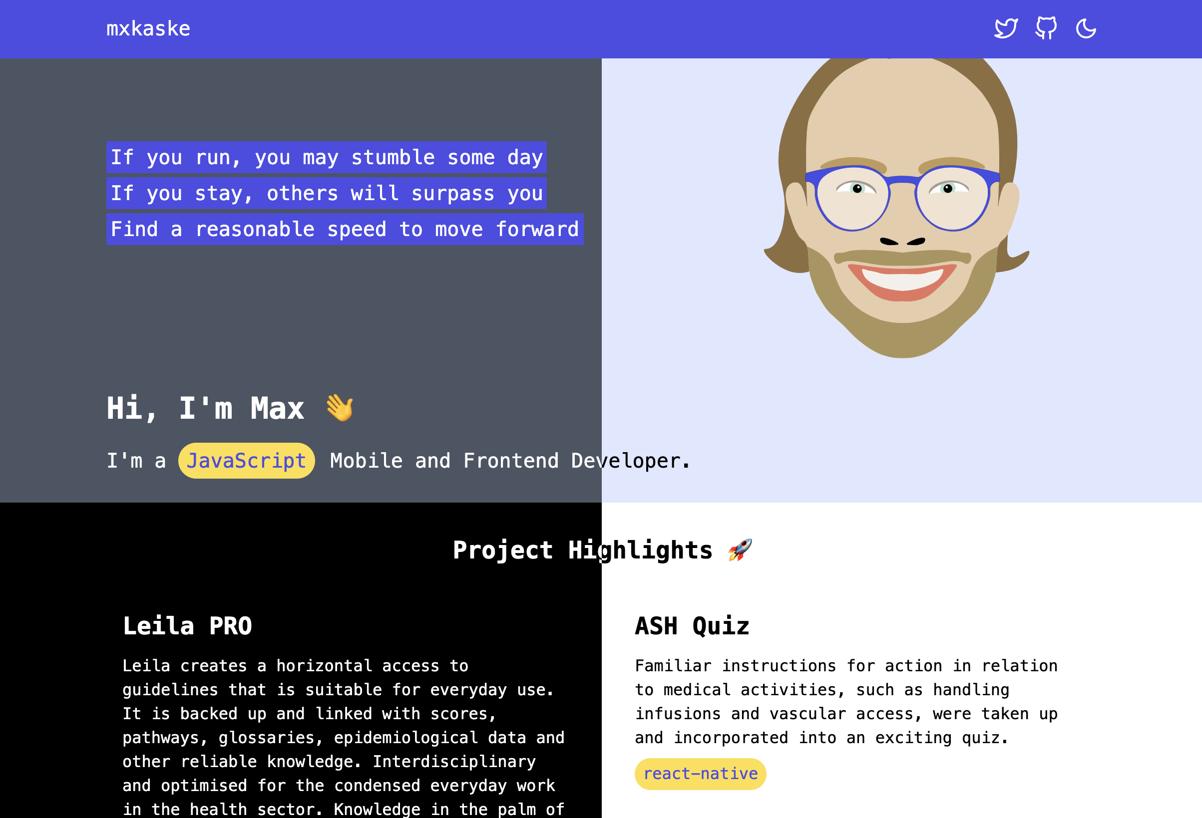
The first design of the website was build one year ago. It was meant to be a "portfolio" page where I would present my projects and the frameworks / libraries I've been using.
If you wonder how it looked like (dark vs. light):

And if you have not enough, check v1.mxkaske.dev to browse through.
Two points you may have noticed:
- The chosen colors palette has bad gradations
- The text components are too monotone (this might come from the chosen monospace font...) and miss some hierarchy on the page
Back then, I was mostly working on Mobile Applications. It was the first website build with Nextjs. A personal website is a playground where you experiment with new tools. Using it with the utility classes from tailwindcss was one of the biggest take aways I had and that are unthinkable when building in the web.
Tailwindcss makes the experience of styling a lot more fun in web development.
It doesn't mean that you don't have to know CSS but it creates this consistency and easy to access styling in your code. I talked about the experience of Styling in React Native and the advantage to not have to leave the tempate code, be it html or react-native, and not having to remember the class names you invited.
A lot of my learnings over this year, fully working on web development, are represented in the new UI/UX and the code (see GitHub).
If you are a developer interested in UI, have a look at the book Refactoring UI written by the makers from tailwindcss. I really recommend it.
With that site, I am challenging myself to only work with gray tones, typography (size, weight, font,...) to keep it calm and minimal.
Also, props to the following sites I have been inspired from (they look way better):
And let's see what I will come up with next year! Learning brings changes.